Client:
Mujer Avanza
Industry:
Cooperative


The Challenge:
To create the brand identity for Moksha, a project by the «Mujer Avanza» cooperative (enterprising women dedicated to sewing). The goal was to capture the meaning of the Sanskrit word «liberation,» symbolizing economic and personal emancipation.
The Solution: A Typographic Design with Soul and Origin.
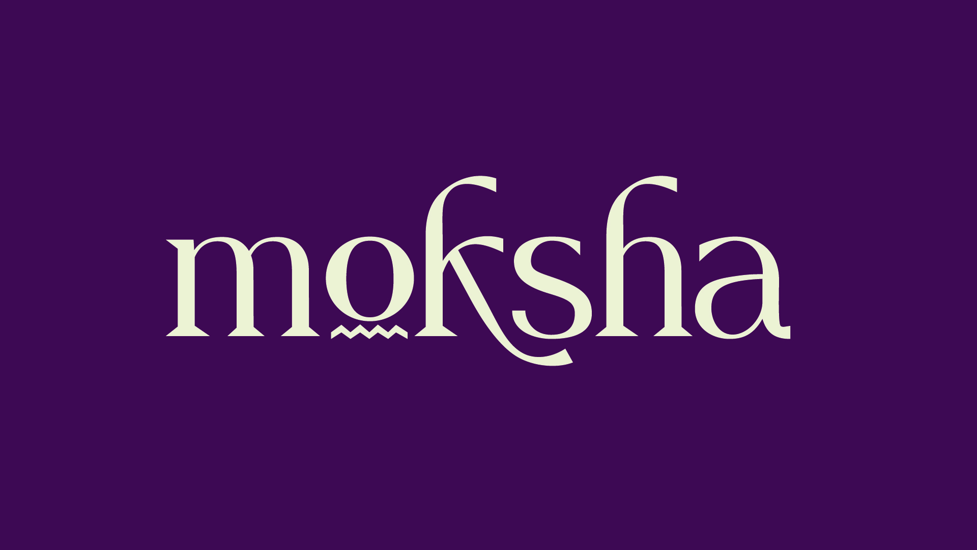
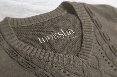
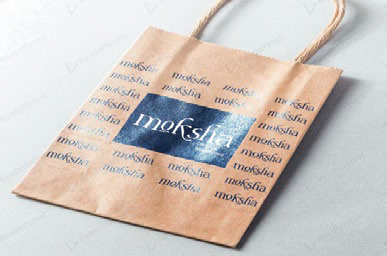
The brand identity for Moksha is centered around a logo built with a completely custom typeface, a creation of Bluepencil Studio, with the expertise of our specialized typography project, CentroType. This approach allowed us to imbue each letter with a profound meaning. Specifically, the shape of the letter «o» at its base is inspired by the texture of fabric and the movement of thread, a direct nod to the cooperative’s dedication to sewing. On the other hand, the dynamic and extended shapes of the letters «k» and «h» seek to evoke the feeling of freedom and the spirit of emancipation that the name «Moksha» represents. Complementing this unique logo, a comprehensive brand manual was developed to ensure the correct and coherent application of the visual identity across all communication channels of «Mujer Avanza.»
The Impact:
The Moksha brand became a key tool for the cooperative, allowing them to present themselves professionally and attractively. Through this design, the studio managed to shape the message of empowerment, helping the women achieve the freedom that the word «Moksha» represents.